Dashboards
 HARi dashboards give you a real-time overview of your business. Track pipeline value, conversion rates, task progress, and any metric that matters to your team — all driven by your CRM data.
Dashboard scopes
Section titled “Dashboard scopes”Dashboards have one of three scopes:
- System — pre-seeded by the platform or a solution. Available to everyone in the workspace, can be customised but should not be deleted by end users.
- Personal — dashboards you create for yourself only. No one else sees them.
- Shared — dashboards visible to your team. Useful for sales meetings, management reviews, and standups.
A dashboard can also be marked as your default — that’s the one HARi opens when you click the Dashboards link in the sidebar.
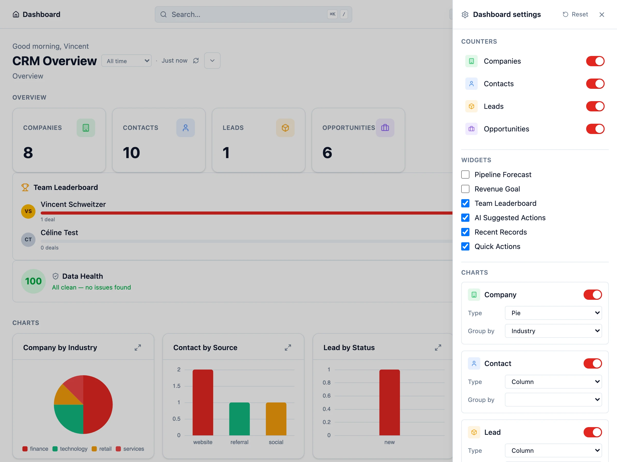
Built-in widgets
Section titled “Built-in widgets”Every dashboard can mix automatic widgets with custom charts:
- Counters — one tile per entity with the live record count, plus deltas where relevant
- Pipeline forecast — projected close value based on opportunity stage and probability
- Revenue goal — progress toward a configurable target with visual progress
- Team leaderboard — top performers by closed revenue
- Data health — coverage and quality indicators across your data
- Recent records — latest activity across the workspace
- Quick actions — shortcuts to common create flows
Each automatic widget can be toggled on or off from the dashboard settings panel.
Custom charts
Section titled “Custom charts”You can add your own charts to any dashboard. Each chart is configured against a specific entity:
| Chart type | Best for |
|---|---|
| Column / Bar (regular, stacked, 100%) | Comparing categories — deals by stage, leads by source |
| Line | Trends over time |
| Area (regular, stacked, 100%) | Cumulative trends |
| Pie / Doughnut | Proportions of a total |
| Funnel | Conversion stages |
For each chart you choose:
- Entity — which records to summarise (Opportunity, Task, Lead, etc.)
- Aggregate — count, sum, average, minimum, or maximum of a field
- Group by — the dimension to split by (stage, owner, source, month)
- Date grouping — when grouping by a date field, roll up by day, week, month, or year
- Filters — narrow the dataset (e.g. only deals closing this quarter)
- Sort & limit — value ascending/descending, label alphabetic, or a Top-N / Bottom-N pill
Charts are interactive — click a segment to drill into the underlying records.
Downloading chart data
Section titled “Downloading chart data”Every chart has a small download icon next to its fullscreen icon. Click it to save the chart’s underlying numbers as a CSV file (<chart-title>-<date>.csv). The file has two columns — Label and Value — and opens directly in Excel, Numbers, or Google Sheets. Useful for ad-hoc analysis, board reports, or pasting into a deck.
Building a dashboard
Section titled “Building a dashboard”- Open Dashboards and pick an existing one or click New dashboard.
- Give it a name and choose a scope (personal or shared).
- Open the settings panel and toggle which built-in widgets you want.
- Add custom charts, then drag them on the grid to position and resize.
- Save. Your layout is stored on the dashboard, not in the browser, so it follows you across devices.
Layout and responsiveness
Section titled “Layout and responsiveness”Dashboards use a flexible grid. Widgets can be moved and resized in edit mode, and on smaller screens they collapse into a single column in the order you arranged them.
Examples
Section titled “Examples”Sales manager dashboard:
- Pipeline funnel (leads to closed-won)
- Revenue by month (line chart)
- Pipeline forecast widget
- Team leaderboard
- Top-10 deals closing this month (custom chart)
Individual rep dashboard:
- My open deals by stage
- Tasks due today
- Revenue goal toward monthly target
- Recent records feed