Customizing Your Dashboard
Customizing Your Dashboard
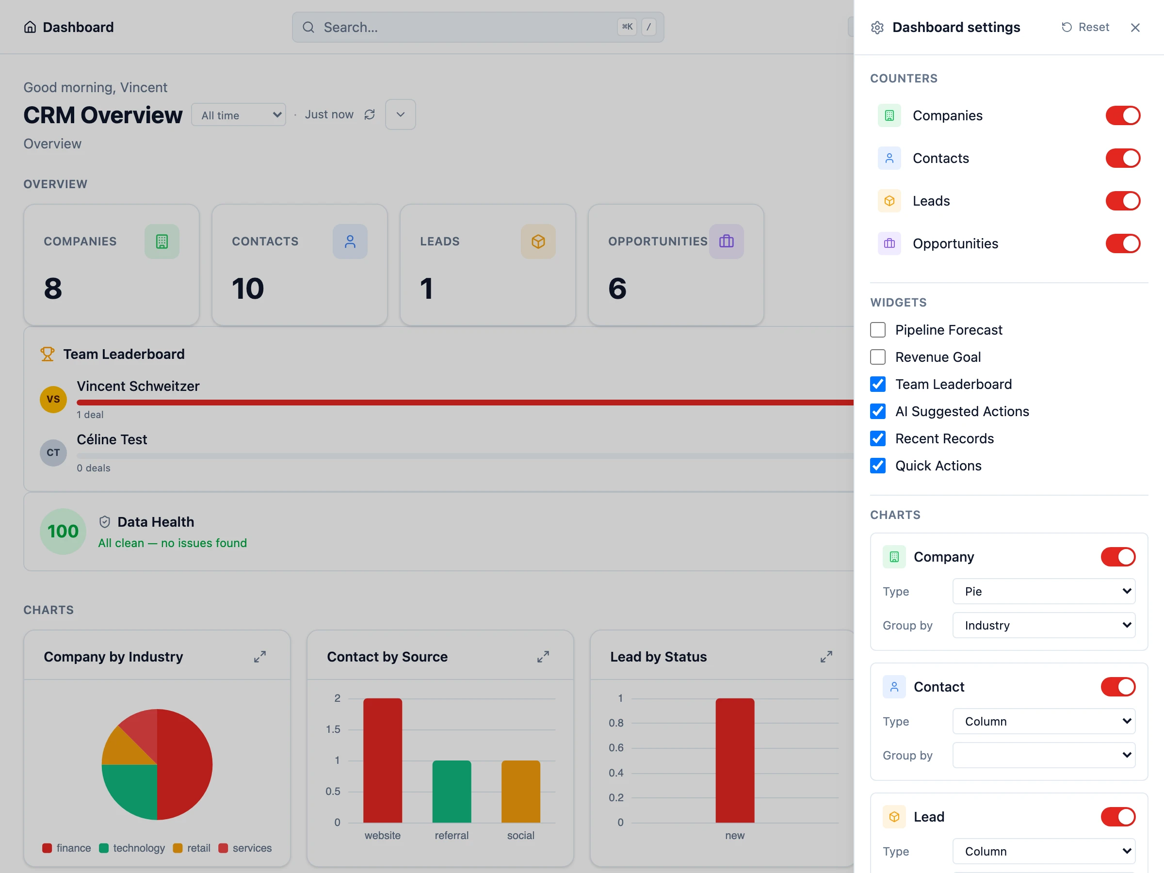
Section titled “Customizing Your Dashboard”The dashboard is the first thing you see when you log into HARi CRM. It gives you an at-a-glance view of your business through widgets and charts. You can create multiple dashboards and customize each one for different purposes.
Dashboard Types
Section titled “Dashboard Types”HARi supports two types of dashboards:
- System dashboards — Created by admins. Visible to all users (or users with specific profiles). Great for company-wide KPIs like total pipeline value or monthly revenue.
- Personal dashboards — Created by individual users. Only visible to the user who created them. Perfect for tracking your own deals, tasks, or activity.
Creating a Dashboard
Section titled “Creating a Dashboard”- Click the Dashboard icon in the sidebar
- Click New Dashboard
- Give it a name (e.g. “Sales Overview” or “My Pipeline”)
- Choose System or Personal
- Click Create
Adding Widgets
Section titled “Adding Widgets”Widgets are the building blocks of your dashboard. Each widget displays a specific piece of data.
- On your dashboard, click Add Widget
- Choose a widget type:
- Chart — Pie, doughnut, bar, column, line, area, or funnel chart based on your data
- Counter — A single number (e.g. “Open Deals: 24”)
- Goal — Track progress toward a target (e.g. monthly revenue goal)
- Forecast — Pipeline forecast based on stage probability
- Leaderboard — Ranked list (e.g. top reps by closed revenue)
- Record List — A compact list of records matching a saved view
- Data Health — Coverage / quality indicators for an entity
- Configure the widget by selecting the entity, the field to aggregate, and any filters
- Click Save
Chart Types
Section titled “Chart Types”HARi includes seven chart types, each suited to different data:
- Pie / Doughnut — Best for showing proportions (e.g. deals by stage, contacts by source)
- Bar / Column — Compare values across categories (e.g. revenue by month)
- Line / Area — Track trends over time (e.g. new contacts per week)
- Funnel — Visualize conversion through stages (e.g. pipeline funnel)
Arranging Your Layout
Section titled “Arranging Your Layout”Widgets can be resized and rearranged by dragging. Place the most important metrics at the top so they are visible immediately. You can create multiple rows of widgets to organize information logically.
Managing Multiple Dashboards
Section titled “Managing Multiple Dashboards”Switch between dashboards using the dropdown at the top of the dashboard page. You can create as many dashboards as you need — for example, one for sales, one for support, and one personal dashboard for your daily tasks.
Next Steps
Section titled “Next Steps”- Create a Saved View to build the filtered lists that power your dashboard widgets
- Build a Sales Pipeline to set up the data your funnel chart will visualize
- Interface Guide for a full tour of the HARi interface