How to Add a Chart to Your Dashboard
How to Add a Chart to Your Dashboard
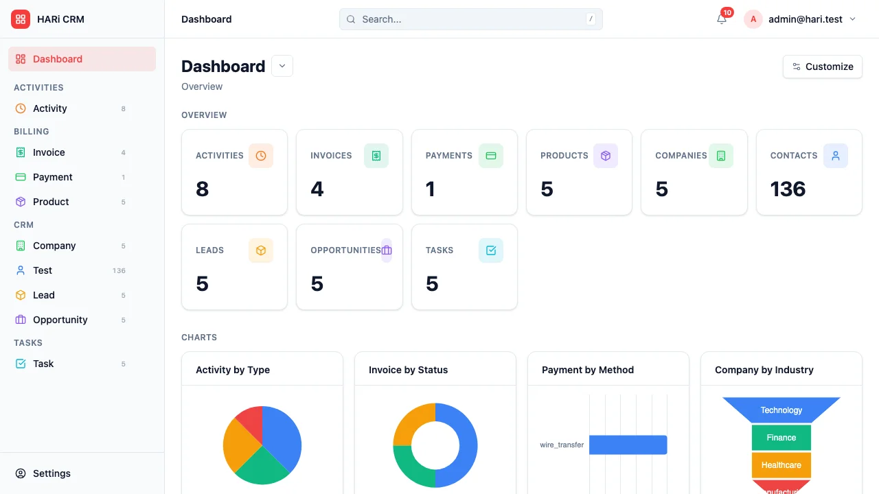
Section titled “How to Add a Chart to Your Dashboard”Dashboard charts give you a visual summary of your data — pipeline value by stage, deals won per month, activity counts by team member, and more. You can build a personalized dashboard that shows exactly what matters to you.
Building a Chart
Section titled “Building a Chart”Charts are built from any entity list view, then surfaced on the dashboard.
- Open the entity list you want to chart (e.g. Opportunities)
- Open the chart pane on the right of the page
- Click the + button labelled New chart
- Configure the chart:
- Entity — Pre-filled from the list you opened
- Chart type — Column, Bar, Stacked Column / Bar, 100% Column / Bar, Line, Area, Stacked / 100% Area, Pie, Doughnut, or Funnel
- Aggregate — Count, Sum, Average, Minimum, or Maximum
- Aggregate field — Which field to aggregate (required for Sum / Avg / Min / Max)
- Group by — How to break down the data (e.g., by stage, by month, by owner)
- Date grouping — Day, Week, Month, or Year (when grouping by a date field)
- Sort — Value or category, ascending or descending
- Limit — Top 3 / 5 / 10, Bottom 3 / 5, or All
- Save the chart
The chart now lives on the entity, and you can pin it to your dashboard.
Showing Charts on the Dashboard
Section titled “Showing Charts on the Dashboard”- Go to your Dashboard
- Click Customize
- In Simple mode, pick which entities to show charts for and which chart per entity
- In Grid mode, drag a chart widget onto the canvas, pick the entity, and choose the saved chart
- Save the layout — the dashboard updates and refreshes automatically as your data changes
Chart Types and When to Use Them
Section titled “Chart Types and When to Use Them”| Chart type | Best for |
|---|---|
| Column / Bar | Comparing values across categories (deals by stage, revenue by month) |
| Stacked / 100% variants | Comparing categories AND showing composition within each |
| Line / Area | Tracking trends over time (new leads per week, revenue growth) |
| Pie / Doughnut | Showing proportions (deals by source, contacts by region) |
| Funnel | Visualizing conversion through stages (sales pipeline) |
Arranging Your Dashboard
Section titled “Arranging Your Dashboard”In Grid mode you can:
- Drag widgets to reposition them
- Resize by dragging the bottom-right corner
- Remove by clicking the close icon on the widget
Example Dashboard Setup
Section titled “Example Dashboard Setup”A sales manager might set up:
- Funnel chart — Pipeline value by stage
- Bar chart — Deals won per month
- Pie chart — Revenue by source
- Line chart — New leads per week