
Dashboard Metric Tiles
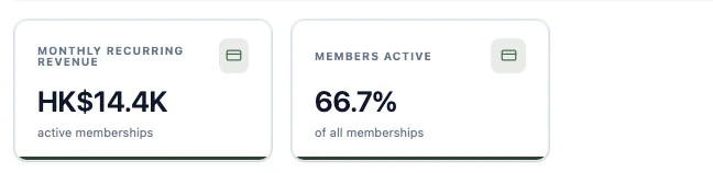
A metric tile puts one business number on your dashboard at headline size: total monthly revenue, the average value of a membership, the share of customers who are still active. You choose which records it reads, what it measures, which field it works on and which period it covers. HARi keeps it up to date on its own.
Seeing that number early matters more for a small business than for a large one. The JPMorgan Chase Institute studied 597,000 small businesses and reported that “the median small business holds 27 cash buffer days in reserve” (Cash is King: Flows, Balances, and Buffer Days, JPMorgan Chase Institute). With under a month of runway, a revenue figure you have to export and add up by hand is a figure you check monthly. One sitting on your dashboard is a figure you check every morning.
What a metric tile can measure
Section titled “What a metric tile can measure”One dropdown, seven answers. Measure decides what the tile does with the records it reads.
| Measure | The question it answers | Example |
|---|---|---|
| Count of records | How many are there? | How many memberships |
| Sum | What do they add up to? | Total monthly revenue |
| Average | What is the typical one worth? | Average monthly value per member |
| Minimum | What is the smallest? | Cheapest active plan |
| Maximum | What is the biggest? | Largest single deal |
| Count of different values | How many different ones? | How many different companies ordered |
| Ratio / % | What share of them? | Share of memberships that are active |
Sum, Average, Minimum, Maximum and Count of different values each ask for a Field as well — the number they work on. Count of records and Ratio / % do not, because they count records rather than adding a value up, so the Field picker does not appear for them at all.
If the field you pick holds money, the tile formats it as money and shortens it to fit: a tile totalling HK$14,400.00 reads HK$14.4K, with the exact figure shown on hover. Metric tiles live on the same board as your charts and built-in widgets — see Dashboards for the rest of what a dashboard can hold.
Build a metric tile
Section titled “Build a metric tile”Metric tiles are added in Grid mode, the layout where you place and resize each widget yourself.
- Open the dashboard and click Customize.
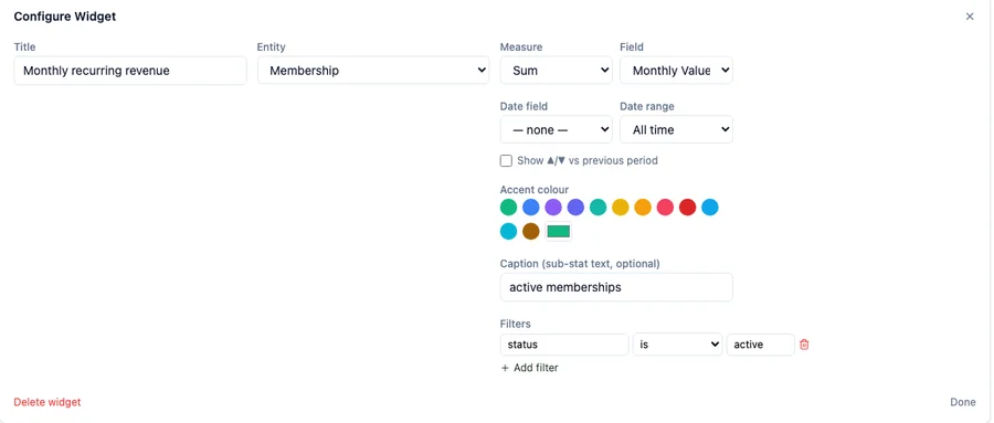
- Click Add Widget, leave the type on Counter (KPI), choose the Entity the tile reads, give it a title, and click Add.
- Click the new tile to open Configure Widget.
- Pick the Measure, then the Field it works on.
- Optionally add a Caption under the number, an Accent colour, and Filters.
- Click Done, then Save.
Drag a tile by its header to move it, and drag its bottom-right corner to resize it. Nothing is stored until you click Save.
Show a percentage
Section titled “Show a percentage”Choose Ratio / % as the measure. A percentage is two counts, so the panel asks for both:
- Count records where… — the top of the fraction. A membership counts here if its Status is
active. - …out of records where — the bottom. Leave it empty to compare against every record.
On a workspace with six memberships, four of them active, that tile reads 66.7%. Add a condition to the bottom box — say, everything except the ones that have churned — and the same tile answers a narrower question, measured against a smaller group.
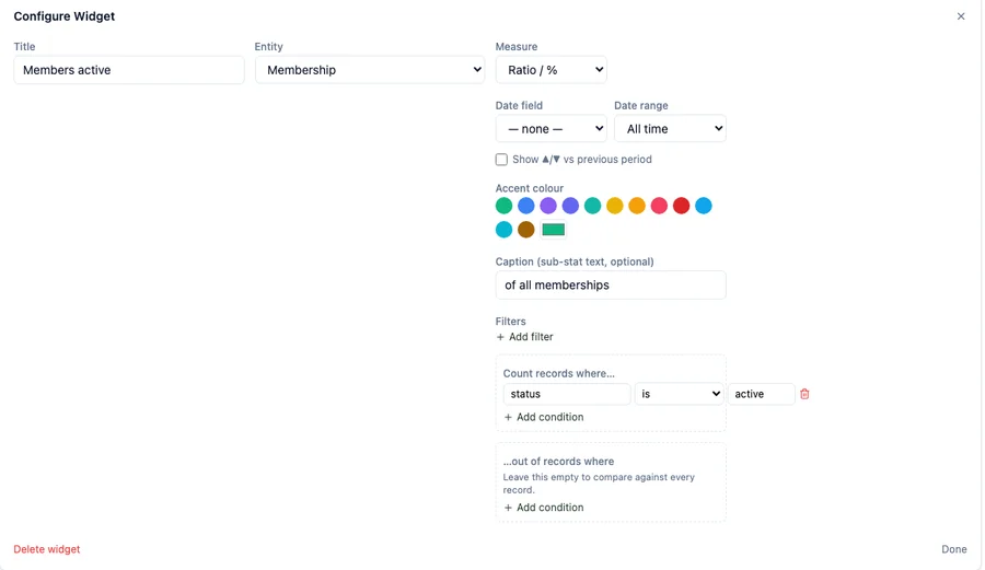
A percentage tile needs a top half. If you leave Count records where… empty, there is nothing to measure, and the tile shows a dash rather than a number. That dash is not 100% — it is a tile waiting for its condition.
Limit the tile to a period
Section titled “Limit the tile to a period”Date range narrows the tile to a window of time: Today, Yesterday, This week, Last week, This month, Last month, This quarter, This year, Last year, Last 7 days, Last 30 days, Last 90 days, or All time. Date field says which date that window is measured against — for a membership, its Start Date or its End Date. Leave it on — none — and the window is measured against the day the record was created.
Tick Show ▲/▼ vs previous period and the tile also reports the same measure for the window before it, and the change between the two. A “Last 30 days” tile counting new contacts on a workspace with 40 contacts in total reads 10, marked down 3 against the 13 of the previous thirty days — the number you actually want, rather than the all-time total.
Narrow it to the right records
Section titled “Narrow it to the right records”Filters decide which records the tile is allowed to count. Each filter is a field, a comparison and a value, and they all have to be true. The comparisons on offer are is, is not, the four number comparisons (>, ≥, <, ≤), contains, and has (relation) for a linked record.
contains matches on part of the text rather than the whole of it: on those same six memberships, a contains filter on Status looking for activ counts the four active ones, and a value that matches nothing counts none of them.
What an empty tile is telling you
Section titled “What an empty tile is telling you”A tile with nothing to measure does not show the same thing for every measure, and the difference is deliberate:
- Sum shows 0. Nothing added up to nothing, and zero revenue is a real answer worth reading.
- Average shows —. There is no average of no records, so the tile says so instead of inventing a zero.

If a tile shows a dash and you did not expect one, check its filters and its date range first — the usual cause is a filter that matches nothing.
Simple mode and Grid mode
Section titled “Simple mode and Grid mode”Dashboards have two editing modes, and only one of them will build you a board of several different metrics.
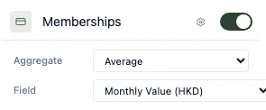
Simple mode offers one counter per entity. Open Customize and the settings panel lists every entity in your workspace with a toggle to show or hide its counter, and a ⚙ to set that counter’s measure, field, filter and comparison. It is the fastest way to turn a single record count into a real figure — but there is one Membership counter, not six, so a board of six different membership metrics is not something Simple mode can express.
Grid mode has no such limit. Add as many Counter (KPI) widgets as you like — several against the same entity, each with its own measure, field, period and filters — and arrange them on the grid. Build the six-tile board here.
Switching between the two modes keeps the dashboard you are on; use the Simple mode / Grid mode button at the top right to move between them.
Related pages
Section titled “Related pages”- Dashboards — scopes, built-in widgets, charts and layout
- Formula Functions — work a number out on the record itself, so a tile can total it
- Views — the same filtering ideas applied to a list of records